
Why Your Norwich Business Needs a Mobile-First Website in 2025


Introduction
In 2025, mobile traffic continues to dominate the internet, and in Norwich, it’s no different. If your website doesn’t deliver a seamless mobile experience, you’re likely losing traffic, rankings, and sales. This post breaks down why a mobile-first website is no longer optional and how Temple Brown delivers responsive, high-converting mobile experiences to help Norwich businesses stay ahead.
The Mobile-First Era
More than 70% of website traffic in the UK now comes from mobile devices. Your audience is browsing, booking, and buying on the go. A desktop-only website feels clunky, outdated, and untrustworthy. Mobile-first design means planning and building your site primarily for smartphones, then expanding it for tablets and desktops. It flips the traditional approach on its head, and it’s what Google expects.
Google's Mobile-First Indexing Explained
Since 2020, Google has been using the mobile version of your site as the default for indexing and ranking. If your mobile experience is poor, slow, hard to navigate, or incomplete, it will hurt your search engine performance. For local Norwich businesses competing in saturated markets, poor mobile optimisation means fewer customers and lower revenue.
How Mobile Experience Impacts SEO & Conversions
User experience on mobile directly affects bounce rate, time on site, and conversions. Features like thumb-friendly menus, fast load speeds, and clear calls-to-action can make the difference between a lead and a lost visitor. Poor mobile UX results in lower rankings and higher ad spend to compensate.
What Norwich Users Expect in 2025
Your visitors expect speed, clarity, and simplicity. They expect pages that load in under three seconds, buttons they can tap easily, clear navigation structures, and accessible contact options like tap-to-call or location pins. Whether they’re looking for a web designer in Norwich or booking a local driving course, users demand ease and responsiveness.
Mobile UX Best Practices We Apply at Temple Brown
At Temple Brown, our design process starts with the understanding that mobile and desktop experiences must be treated differently. We design using two frameworks: one tailored for desktop and laptop users, and another specifically created for smartphones. This approach allows us to redesign sections of a website to function optimally depending on the device being used.
A mobile phone behaves like a one-column website: vertical, sequential, and compact. In contrast, desktop layouts allow for multiple columns and more complex navigation. Knowing how to present content effectively in each setting ensures accessibility, clarity, and conversions.
By reimagining page elements for each screen type, we enhance the user journey. We adjust content order, media size, spacing, and layout hierarchy to support user experience and business goals. Our mobile-first websites are built to perform. They are optimised for speed and pass Google’s Core Web Vitals. They are focused on converting with well-placed calls-to-action that align with how users scroll. They are localised with integrated maps, regionally relevant keywords, and geo-targeted schema. They are also guided by data through user behaviour tracking, heatmaps, and session analytics.
We conduct a comprehensive mobile UX audit for every client, aligning each part of the customer journey with real-world usage. Every design decision is made with business outcomes in mind, from the first tap to the final conversion.
Case Study Highlights
In late 2024, we rebuilt a mobile-first site for The Best Intensive, a Norwich and Bristol-based intensive driving school. Their old website took more than six seconds to load and did not function properly on mobile devices. After the redesign, load time dropped to 1.3 seconds and mobile conversions tripled. Thanks to responsive layouts, streamlined calls-to-action, and targeted schema markup, their visibility on mobile search results increased significantly.
We have also delivered successful mobile-first experiences for other Norwich businesses across a range of industries. These case studies demonstrate improved performance, usability, and conversion rates through mobile-first design. Specific examples with project links and visuals will be added to support this section further.
Conclusion
In today’s digital landscape, mobile is no longer just another channel. It is the primary point of contact for your customers. More people are discovering, researching, and acting on mobile devices than ever before. If your site cannot meet their expectations, they will turn to a competitor that can.
At Temple Brown, our mobile-first design philosophy is backed by data, user insights, and a clear understanding of what drives results. We do not simply shrink a desktop design to fit a phone screen. We rethink the experience entirely, using dual-framework design, customer journey mapping, and performance audits to ensure seamless functionality across devices.
We also align mobile design with your broader business strategy. It is not enough for your website to look modern. It must also perform, engage, and convert. This is especially important in a competitive local market like Norwich, where smart design can make the difference.
Working with Temple Brown means building forward. You avoid the common pitfalls, uncover new opportunities, and invest in a digital presence designed for growth. If your Norwich business is not mobile-first yet, now is the time to act. Let us help you build a mobile experience that delivers measurable results.
Contact us today for a mobile-first audit or a consultation on redesigning your website for the modern customer.

Featured Project

Check out our insights

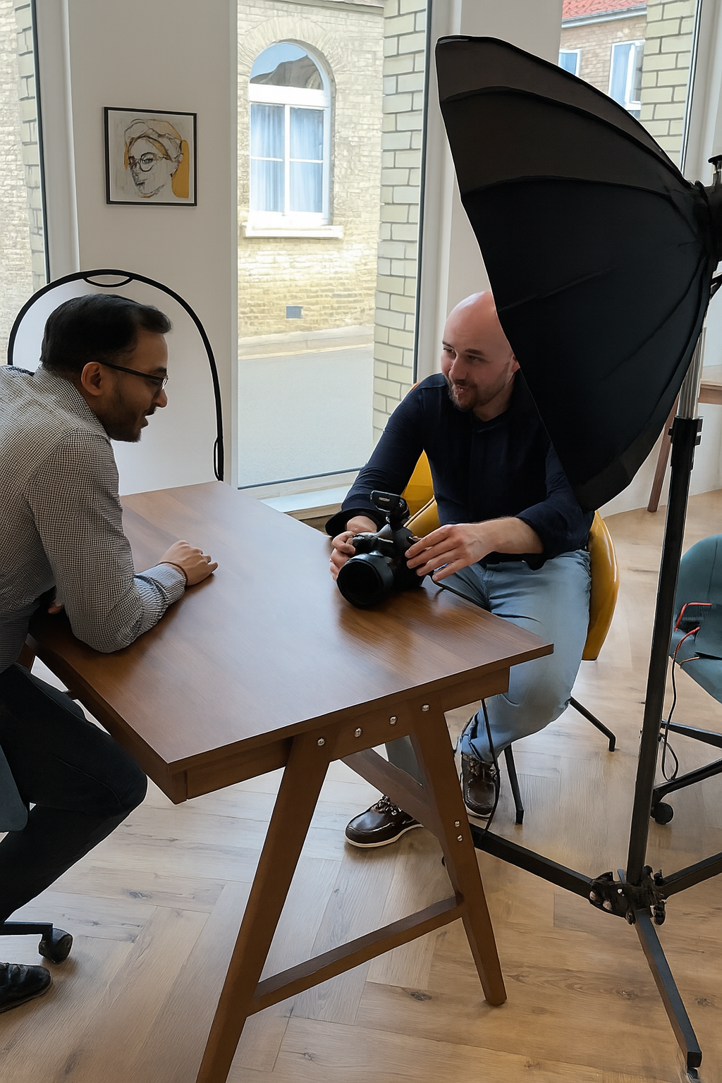
Brand & Headshot Photography Norwich: How Temple Brown Helps Businesses Stand Out (Interview)
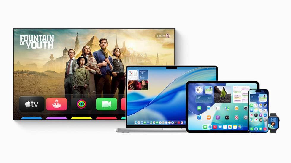
Apple Liquid Glass Update: Web Design Trends 2025 & The Future of UI/UX
How Norwich Businesses Can Reposition with Expert Brand Photography by Temple Brown
Check out all of our new articles!